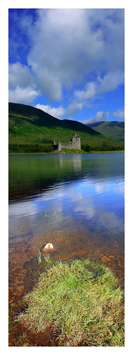
A very nice lady I met through my BabyCenter.com "birth club" (March 2006 Babies) who happens to be a dab hand with PhotoShop made these cover designs for me. They're not what a publisher would put out, by any means (though I've seen worse on some e-pubbed books) but I think they have a good feel for what I'm going for in a cover. I.e. no shirtless kilted man, no bodice-ripping, no pictures of people who look nothing like my characters. And they are WAY better than I could ever come up with. Mad props to her for doing them.
If I ever self-pub (if I ever get this darned thing finished, more on that in a later post) I might use one of these or something very like it.
What do you guys think?
Library in English Book Sale!
16 hours ago


3 comments:
My favorite is the middle one...except I want something else at the bottom of the page. Those trees/shrubs don't seem quite right. Perhaps use the castle image from the bottom...with the bigger ripples.
But then, I'm not a graphic artist. I think I primarily like the verticality of the middle one.
Oooh, and did I miss that RG is your chosen pseudonym???
ohhh, I love these. For me, I prefer the first one, except for the belted feel of it. I like the separation of author name and title. It makes the eye sweep the page opposed to remaining in one spot. I love the font. Very romantic.
Why wouldn't an publisher use these?
I love the second one! I would definitely pick that book up if I saw it in a store: "hey, Scotland! Wonder what it's about?"
Post a Comment