Opinions needed - see the end of this post.
Not as much progress as I'd hoped this weekend. We had houseguests (my mom on Saturday, his dad on Sunday) and DH and I went out on a date Saturday night. We saw The Bourne Ultimatum - mucho fun.
Also, I don't have any scenes that have "come to a boil" yet, so the writing was slow. I've mentioned before how I put scenes on a back burner and let them "simmer" until they're ready to write. To further that analogy, at any given time I usually have several scenes I imagine as pots of water on a stove. Usually, at least one of them has come to a boil by the time I sit down to write. But I've been pulling all the boiling pots off to write them lately, and by this weekend none of the new pots had come up yet. I can see little threads of steam wafting off them, and some even have bubbles around the edges. But I'm waiting for that first bubble to break the surface. What Diana would call a "kernel" - the descriptive sentence or line of dialog that is my foot into the door of the scene.
While I was waiting (a watched pot never boils, after all) I got to fiddling with customizing Blogger layouts. I only know a smattering of HTML, and no CSS at all. But one thing I pride myself on is being able to learn quickly, and there are a plethora of DIY sites explaining how to add sidebars, put images behind, etc.
So, I need you guys' (or "y'all's" for Deniz *g*) honest opinion on this:
Jenny's Test Blogger Layout
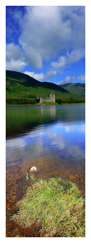
Does that look okay/work on your browser? Text easily readable? The picture's not too distracting, is it? (By the way, that's Kilchurn.) Keep in mind the sidebars will be fleshed out with all sorts of widgets like I have right now - LibraryThing, link lists, wordcount, visitor maps - and other fun content I add as I go along.
Or should I stick to the clean and simple approach with text-on-solid? I want to have some feel of Scotland on the blog.
Also, anyone know how to properly attribute the background image when I got it off Flickr and can't find the photographer's real name or contact info? Right now I've just linked to the photo page on Flickr in the footer. The image is copyrighted - "some rights reserved" - but as long as I attribute it (trying to) and don't alter the image (I haven't) I'm allowed to use it.
About Me

- Jenny
- I have a degree in radiological medical physics, a wonderful husband, an awesome little boy and a darling foster daughter. I've finished my first novel (a time-travel romance set in Scotland), revised the heck out of it, and am currently querying agents.

(c) Used with permission.
MacGregor Crest

Recommended Books


 (c) 2007
Used with permission.
(c) 2007
Used with permission.
Alec & Elspeth

Subscribe To


Progress


111587 / 100000
(111.59%)
SFD Complete!
(111.59%)
SFD Complete!
99142 / 111587
(88.85%)
First Cut
(88.85%)
First Cut
95098 / 95000
(100.1%)
Second Draft Complete!
(100.1%)
Second Draft Complete!


90892 / 90000
(100.1%)
FINAL DRAFT
COMPLETE!!!
(100.1%)
FINAL DRAFT
COMPLETE!!!

Glen Strae from Kilchurn
Blogging Friends
-
-
Immortals3 years ago
-
Snippets9 years ago
-
Saying Goodbye9 years ago
-
-
In the mood15 years ago
-
I've Finished!16 years ago
-
Your Voice16 years ago
-
Soundtrack16 years ago
-
Switched!17 years ago
Writing/Publishing Blogs
-
Face-Lift 15432 weeks ago
-
Capturing the Castle2 years ago
-
This week in books 7/14/178 years ago
-
Calculations9 years ago
-
BookEnds Has Moved10 years ago
-
-
Pub Rants Has Moved!!12 years ago
-
Becoming a Bestselling Fiction Author12 years ago
-
New Blog for TKA13 years ago
-
RED MORTAL OUT TODAY!! WOOT!14 years ago

Glen Strae
Free Books!
Visitors

8 comments:
Hi Jenny!
The new layout looks nice on my PC, text is easy to read and I *really* like the picture in the background. Until it loaded, though, I was looking at a grey-blue background with the nice forest green, and I was trying to come up with a nice way to say "ugly." (BG) S'good!
Cindy -
Thanks! I love that pic - it's set as background on my work computer and laptop right now.
On of my main concerns is screen resolution...one of the computers here at work is set ultra-high and so on it the pic is only about 3/4 of the screen. The rest is that "ugly" blue-gray, which I can change to green and will, but I'd rather the pic take up the entire background.
Any ideas on how to have the pic stretch to fit?
Thanks again,
~Jenny
Jenny, It's pretty and all...but I found the background picture to be distracting. With the white-on-dark text--hard on my eyes, even by itself--I think I'd find it too difficult and "busy" to read comfortably once you got actual posts going. Just my opinion, of course. Perhaps you could put a picture in the sidebar instead?
First of all: very nice, wonderful picture :)
Second: Maybe you can make the background the text appears on a bit less see-through (or is that a default setting?) and the picture itself a bit lighter. Perhaps it won't be that distracting then while reading.
I usually don't get distracted that easily by background pictures but I can imagine that someone elese does (as beth mentions)
Nina
I forgot:
Do you have a Flickr/Yahoo account?
If not, I could contact the photographer for you. If you are logged in you have the possibility to send a "FlickrMail". There's a form coming up, not showing the e-mail addy, but I guess this way would work.
Nina
I Jenny,
I think it looks great, and I do like the picture, but if I had to have a reservation I would say it looks maybe a teensy weensy bit too "nature-y", like something you'd see on an environmentalist's blog, maybe a little too green? Not easily identifiable as Scotland by non-natives. Is there maybe a shot of the castle itself?
Beth -
Yes, that was my concern, knowing some people have a hard time with light-on-dark. Personally I like it (hence the current layout), but I want this to be accessible for the majority. I'll keep fiddling. I'm waiting to hear back from a couple of photogs wrt fully copyrighted pics that would work great in the sidebars.
Nina -
Thanks! I could make the text "wrapper" more opaque and wash out the pic a bit, which I may do. I do have a Flickr account (now) and did send messages to a couple of people that way. Thanks for the offer, though!
Deniz -
Oh, the castle's there. It's easier to see without text overlaying, but look at the left edge of the post frame and you'll see it. I love the colors but want the castle to be a little more obvious. I'll see what else I can come up with. Thanks for looking!
~Jenny
Post a Comment